








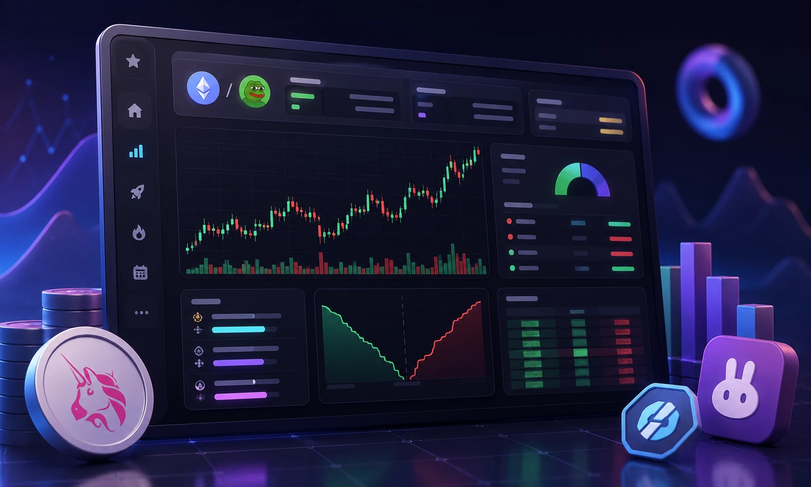
What a DEX pair page is actually showing you
A DEX pair page is a real-time dashboard for one specific trading pair on one specific liquidity pool. The pair is almost always a new token paired against a stablecoin like USDT or USDC, or against a major coin like ETH, SOL, or WBTC. The page is run by data aggregators such as DexScreener, DEXTools, or Birdeye, which read the blockchain directly and pull trades, liquidity, and holder data from the underlying contracts.
That sounds neutral, but it is not. The token issuer lists the pair, often minutes after deploying the contract. The same wallets that created the token can seed the liquidity pool, trade against themselves on both sides, and walk away minutes later. The aggregator is just showing you what is on-chain. It is not vouching for the project. The pair page is a tool, not a referee.
The columns on the page are crowded by design. There are dozens of numbers, social links, and small badges. New traders tend to fixate on the price chart and the percent change, which is the least useful information there. The price you see is whatever the last trade was, and on a thin pool that price can be anything. The real story is in the supporting data: how much liquidity backs the price, who owns the tokens, and whether the contract has anti-sell code baked in.
The risks before you click anything
Pair pages are the single most targeted surface in crypto for scammers. Three failure modes dominate the failure statistics from reports like Chainalysis and SlowMist, and they all show up as specific patterns on the pair page.
The first is the honeypot. The token looks like it trades normally, until you actually try to sell. The contract rejects every sell, or slaps a 99% tax on it, while letting the deployer wallet sell freely. Tools like the honeypot detector and the buy/sell tax columns on DEXTools and GoPlus exist specifically to flag this. If either column shows a non-zero sell tax, treat the token as hostile by default.
The second is the liquidity drain. The team adds liquidity, lets the chart run for a few hours, then pulls the entire pool in one transaction. Holders are left with tokens that technically still exist but cannot be sold at any meaningful price. The page often shows LP tokens as locked, sometimes in a contract the team still controls. "Locked" just means the LP tokens are in a smart contract. It does not mean the team cannot upgrade that contract, migrate the pool, or use a multisig with a backdoor. Treat "locked until 2030" as a marketing line, not a guarantee.
The third is the slow rug, which is harder to spot. The team does not drain anything. They just unlock a large allocation, sell into a thin book, and the price bleeds for weeks. The on-chain ratio that predicts this is FDV versus circulating supply, which we cover below. Before you trust any number on a pair page, assume the team is trying to make it look as healthy as possible, and verify instead of taking it at face value. Most new tokens lose 80% to 100% of their value within the first month. A small minority will 10x or more. The pair page does not tell you which bucket you are in, but it can rule out the worst cases.
How to read liquidity, market cap, and FDV
Three numbers dominate the top of every pair page, and they are usually listed in the same place. Liquidity, often called pool size or TVL, is the dollar value of the assets sitting in the trading pool. Market cap is the token price multiplied by the circulating supply. FDV, or fully diluted valuation, is the token price multiplied by the total supply, including every token that will ever exist.
Liquidity is the most important of the three. If a pool holds 50,000 dollars of ETH and 50,000 dollars of the new token, the token has 50,000 dollars of real liquidity. A buy of 5,000 dollars will move the price sharply because the pool is small. A buy of 50,000 dollars will exhaust the pool entirely. Liquidity is the actual exit ramp. The deeper it is, the larger the trade you can do without bleeding on slippage.
Market cap on a pair page is calculated using circulating supply, which is the supply that actually exists and is not locked. For a brand-new token, circulating supply is often close to total supply but not always. The pair page pulls the circulating number from the contract, so it depends on what the issuer coded. If you trust the contract, market cap tells you the dollar value of the tokens that are currently in circulation.
FDV is where the trap usually hides. Imagine a token where the price implies a 2 million dollar market cap, but the supply schedule shows that 100 million more tokens unlock over the next year. The FDV is 100 times the market cap. If the team or early investors bought at 1% of the current price, they only need to sell a small fraction of their unlocks to crater the chart. A common rule of thumb is that if FDV is more than 5x to 10x market cap, you are looking at heavy future sell pressure, not a discounted opportunity.
The single most useful derived metric is the liquidity-to-market-cap ratio. Divide liquidity by market cap. If the ratio is below 1%, the token is extremely thin and a single medium-sized trade will move the price wildly. If the ratio is above 5% to 10%, the pool is reasonably deep relative to the value being traded. Ratios above 20% are common for long-established blue-chip tokens and almost never appear on new launches. Anything below 1% is a red flag, no matter how nice the chart looks.
How to read price change, volume, and buy/sell ratio
Below the price line, every pair page shows percentage changes over multiple timeframes: 5 minutes, 1 hour, 6 hours, and 24 hours. Each timeframe tells a different story. The 5-minute change shows what just happened, which is usually noise. The 24-hour change is the first number worth looking at, because it filters out the random wicks that dominate shorter windows. A token that is up 400% in 5 minutes and 12% in 24 hours is probably in a single coordinated buy, not a trend.
Volume is the total dollar value of all trades in a given window. Raw volume is easy to fake. A team with 100,000 dollars can wash-trade back and forth between two wallets they control, generating millions in volume and a beautiful chart. The pair page cannot tell you which volume is real. One sanity check is to compare volume to liquidity. If a token has 20,000 dollars of liquidity and 5 million dollars of 24-hour volume, the volume is recycled. The ratio of volume to liquidity on legitimate tokens is usually well below 5x per day. Above 10x, treat the volume as suspect.
The buy/sell ratio is the most underrated field on the page. It is the count of buy transactions versus sell transactions over a window, usually the last hour or 5 minutes. A ratio of 8 buys to 1 sell sounds great, but if each buy is 50 dollars and the sell is 20,000 dollars, the chart is being supported by a thin floor of small traders while a single wallet exits. Always look at the buy/sell ratio alongside the average trade size, which is volume divided by the number of transactions. If the average buy is much smaller than the average sell, the trend is being painted, not created.
Short timeframes are where the worst decisions get made. A token up 50% in 5 minutes is almost always a worse entry than a token up 50% over 24 hours, because the fast move has already attracted momentum chasers and is statistically more likely to reverse. The pair page gives you all these timeframes for a reason. Use them.
How to read the contract, security, and LP columns
Every serious pair page has a section dedicated to the token contract and the security profile. On DexScreener this lives under a contract address you can copy. On DEXTools, the same area is decorated with a small score, badges, and links to GoPlus, TokenSniffer, or similar scanners. None of these tools are definitive, but they catch the most obvious traps.
The first column to check is the buy tax and sell tax. A tax is a percentage of your trade that the contract diverts, either to liquidity, to a burn address, or to the team wallet. A 5% buy tax and 5% sell tax are common on legitimate tokens. A 10% sell tax is a yellow flag. Anything above 20% on either side is a red flag, and a sell tax of 99% or 100% is the textbook honeypot signature. The tax column is the single fastest way to rule out a honeypot. If it shows a sell tax above your comfort level, move on.
The next column is the LP lock status. Liquidity provider tokens are the receipts that represent the team's share of the pool. If the team holds those receipts, they can redeem them and drain the pool. LP lockers like Unicrypt, Team.Finance, and Mudra Locker take those receipts and hold them in a contract with a release date. The pair page shows the lock amount, the locker name, and the unlock date. "Locked" without any of these details often means the LP tokens are sitting in a normal wallet.
Locked is not the same as safe. The team can still call functions on the contract that migrate the pool to a new address, blacklist specific wallets, or upgrade the token logic. A project that has migrated twice, even with locked LP, has shown it is willing to change the rules. Ownership renounced is a badge that means the team has burned the key that lets them modify the contract. It is stronger than locked LP, but it also means there is no upgrade path if a bug is found. There is no perfect answer here, only trade-offs.
The honeypot detector column is the most direct test. It simulates a buy and a sell against the contract and reports whether the sell succeeded. If the simulation says "sell failed" or "sell tax 100%", the contract is hostile. Detectors can be fooled by clever contracts, but they catch the lazy honeypots, which are most of them. A detector running on the same pair page is free insurance. Use it.
How to read holders, top wallets, and concentration
Every pair page links to a holder list, either directly on the page or through a tab. The holder list is one of the most honest views in crypto, because the data is pulled from the blockchain and cannot be faked. The team can make the chart look good, but they cannot make the token disappear from their own wallet.
The first number to look at is the top 10 holder concentration. This is the percentage of total supply held by the ten largest wallets. Below 20% is reasonable for a launched token. Above 40% means a small group of wallets can move the price on their own. Above 60% means the token is effectively centralized, and the next large sell will be a single wallet's decision. The page usually breaks this down by showing the percentage for each wallet individually, which lets you see whether the top wallets are exchanges, lockers, or fresh deployer-funded addresses.
The deployer wallet is one of the top holders in almost every new launch. Pair pages highlight the deployer under names like "Deployer", "Contract Owner", or by tagging the address that originally created the token contract. If the deployer still holds a large percentage of supply, the token has not been distributed. Even if the LP is locked, the deployer can dump their holdings whenever they want, and the locked LP does not protect against that.
Look at the cluster of top wallets. If the top 10 wallets all received their tokens from the same source wallet within the same hour, they are almost certainly the team. Wallet clustering tools and even free explorers like BscScan or Solscan make this visible. A token where half the supply sits in ten wallets that were all funded from one address is a coordinated position, not a community.
The last column to check is the sniper activity. Snipers are bots that buy within the first block of a token launch. A pair page sometimes shows a sniper count or a list of sniper wallets. If 40% of the supply is held by snipers, those snipers will sell the moment the price allows it, and the chart will have a hard ceiling at the price they paid. A sniper-heavy launch is not necessarily a scam, but it is a headwind that closes the upside window quickly.
What this means for your trades
The pair page is a screening tool, not a buy signal. Its job is to filter out the tokens that will drain your wallet before you ever need to think about entries, exits, or chart patterns. The minimum checklist before clicking buy on any new token is short enough to run in 60 seconds: liquidity above some threshold like 50,000 dollars or 100,000 dollars, FDV within 5x of market cap, sell tax below 5%, LP locked in a known locker with a long unlock date, and top 10 holders below 40%. If any of those fail, the trade is not worth thinking about, no matter how good the narrative is.
For tokens that pass the screen, the pair page is the start of your research, not the end. The real questions, like whether the project has a working product, who the team is, whether the social channels are real, and whether the unlock schedule makes sense, live outside the page. The pair page is the gate. The project is the room behind the gate.
Defaults matter. Most traders who use DexScreener and DEXTools do not have a default workflow. They open the page, look at the chart, and react. Building a checklist, looking at liquidity first, then FDV, then taxes, then holders, then LP, takes less than a minute and dramatically reduces the number of times you buy a token that is structurally doomed. The pair page is the same for everyone. The discipline is in how you read it.
How to track new pairs the smart way
New pairs launch every minute, and the ones that turn out interesting rarely stay quiet for long. Watching pair pages manually is a losing game, because by the time a token trends on social media, the deepest liquidity is often gone. Zippfeed surfaces new DEX pair listings and high-volume pairs across chains with sentiment scoring, bullish, neutral, or bearish, and an importance rating, so you can see which launches are actually getting traction before the crowd piles in. Pair that with a checklist built from the fields above, and you have a faster, calmer way to screen the next thousand tokens.