








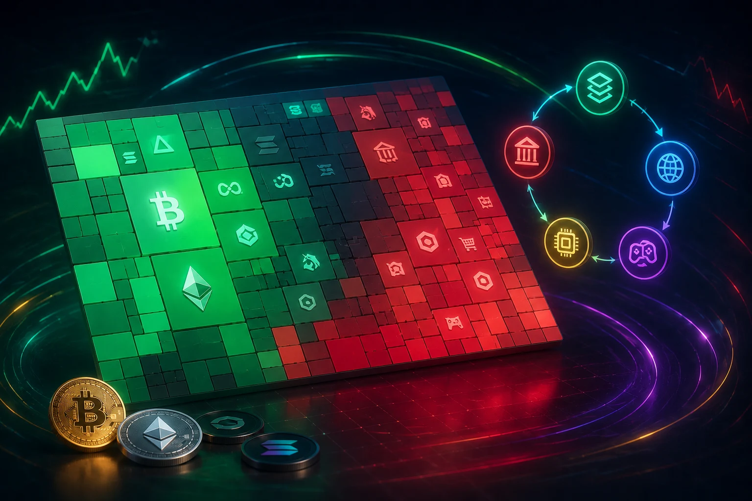
What a crypto heatmap actually is
A crypto heatmap is a treemap, a chart that turns a rectangle into a grid of nested rectangles, where each box is sized by market capitalization and colored by recent percentage price change. Greens mean the asset or sector is up over the chosen window, reds mean it is down, and the intensity of the color usually tracks the magnitude of the move. The boxes are arranged so that the largest coins sit in one corner and get the most visual real estate, which is why Bitcoin almost always appears as a single blocky square covering a meaningful slice of the chart on any major data site.
The first thing to internalize is that a heatmap is a snapshot, not a forecast. The color you see reflects what already happened in the chosen time window, typically the last hour, 24 hours, or 7 days. When you see a sea of green, that means most large coins are up over that window. It does not mean they will be up tomorrow, and it certainly does not mean the trend will continue. The chart is showing you a photograph of recent performance, sized so that more important coins take up more of the frame.
There are two main flavors of crypto heatmap. The first, offered by sites like CoinMarketCap and CoinGecko, is a token-level view where each rectangle is a single coin. The second, offered by tools such as 3Commas, Cryptowave, or TradingView's sector indices, is a sector-level view where each rectangle groups many coins into a category like Layer 1, Layer 2, DeFi, AI, or Meme. The mechanics are identical; the difference is the unit of analysis. Token heatmaps show you which named coins are moving. Sector heatmaps show you which themes are moving, which is usually more useful for understanding rotation.
Why weighting matters more than color
The single most important concept for reading a heatmap honestly is weighting. Most beginner heatmaps use market-cap weighting, meaning a coin with a $50 billion market cap will take up roughly fifty times as much screen space as a coin with a $1 billion market cap. Equal weighting is a less common alternative where every coin or every sector gets the same area regardless of size, and it produces a chart that looks dramatically different from the market-cap weighted version you are used to seeing.
This matters because the choice of weighting can flip the story the chart tells. A market-cap weighted heatmap in a BTC-led rally will look like one giant green Bitcoin block with a small ETH block next to it, and a long tail of mostly-invisible altcoins. An equal-weighted heatmap over the same period might show altcoins ripping higher, because every alt gets the same pixel count regardless of size. Both charts describe the same market, but they emphasize different things. When you see a screenshot of a heatmap on social media, the first question to ask is which weighting was used, because the framing can be cherry-picked.
The second concept is BTC dominance, the share of total crypto market capitalization held by Bitcoin. On most days, BTC dominance is somewhere between 45 percent and 55 percent, which means that even when altcoins are having a great day, the heatmap can still look mostly red if Bitcoin is dumping harder. Conversely, when BTC pumps, the heatmap looks green everywhere even if smaller altcoins are quietly bleeding. This is why so many crypto Twitter posts show a heatmap and claim altseason is here or altseason is over, when in reality they are mostly looking at BTC dominance moving in the background. The heatmap is downstream of one number, and that number is Bitcoin's share of the market.
The risks of reading a heatmap wrong
Heatmaps are not dangerous on their own, but they encourage a specific kind of mistake: treating visual confirmation as a signal. If you only look at the screen and see green, you can convince yourself that the market is healthy and chase positions that are already extended. If you see red, you can panic-sell into a routine dip. The chart is a mirror, not a map, and the risk is that you mistake the reflection for guidance.
A second risk is the survivorship and reclassification problem. Most sector heatmaps rely on a data provider deciding which bucket a coin belongs to. Those buckets drift. A coin that started as a Layer 1 might get reclassified as a DeFi project, or vice versa, and that reclassification can change the color of an entire sector on the chart without any actual change in price. Some "DeFi" categories on data sites include staking derivatives and liquid restaking tokens, which behave more like yield products than like the decentralized exchanges the category was originally built around. The categories look stable, but underneath they shift.
A third risk is recency bias. Heatmaps default to short windows like 24 hours or 7 days, which makes them feel like a real-time pulse. They are not. A coin can be down 30 percent over 24 hours and still be up 200 percent year to date, and the heatmap will not show you that. Conversely, a coin can be green for seven days in a row because of a low-liquidity pump, and the heatmap will not warn you that the move is thin. Color is a one-dimensional summary, and a one-dimensional summary is a place where context goes to die.
Finally, there is the very real risk of trading on screenshots. Influencers post heatmaps with the green ones captioned "altseason" and the red ones captioned "capitulation". Both captions are editorial choices. The same chart, viewed three weeks later, often gets a completely different caption. The honest read is that the heatmap is a record of what already happened, and the words placed on top of it are someone else's narrative.
What sector rotation really means
Sector rotation is the idea that money flows from one theme to another as the market cycle matures. In equities, a classic rotation runs from early-cycle risk-on sectors like industrials and consumer discretionary, into late-cycle defensives like utilities and healthcare. Crypto has borrowed the term, and a common crypto rotation narrative looks something like this: BTC pumps first, then ETH catches up, then large-cap altcoins follow, then small-cap alts and memes explode, then everything corrects, and the cycle resets. It is a tidy story, and it is mostly true over multi-month windows, but the heatmap you are looking at right now is not the rotation; it is a single frame of the rotation.
The honest way to spot a rotation is not on a 24-hour heatmap. It is on multi-week sector performance charts where you can see the relative strength of one group versus another over time. If Layer 1s have outperformed DeFi for six straight weeks, that is a rotation. If memes pumped for three days and then gave it back, that is a single narrative event, not a rotation. The threshold is duration and consistency, not a single green block on a chart.
There is also a less-discussed kind of rotation that happens inside stablecoins and wrapped assets. When traders want to sit on the sidelines, they move into USDT or USDC, which means stablecoin market cap rises while everything else falls. When traders get aggressive, they move out of stablecoins into volatile assets, which means stablecoin market cap falls. A heatmap that includes stablecoin sectors will sometimes show stablecoins as the only green block at the exact moment traders are parking cash, which is a useful signal if you know how to read it, and a confusing one if you do not.
Why the "altseason" label mostly lags the data
The altseason index, popularized by Blockchain Center, scores the market on a 0 to 100 scale based on whether 75 percent of the top altcoins have outperformed Bitcoin over the last 90 days. A reading above 75 is considered "altseason". The number is fun to watch, and the heatmaps you see labeled with the altseason tag usually reference it. The problem is that the index is fundamentally a lagging indicator by construction.
To reach a score of 75, three months of outperformance has to have already happened. By the time the index lights up, the easy money in the rotation has usually already been made. Newcomers who see the green heatmap and the altseason label together often arrive right as the rotation is exhausted, and they end up buying the final leg of the move just before the next sector takes over, or before the entire market pulls back. The label is descriptive, not predictive. It is the market telling you what already occurred, dressed up as if it were forecasting the future.
This is not a reason to ignore the heatmap entirely. It is a reason to invert the usual interpretation. When you see a heatmap screaming altseason, do not ask "should I buy alts". Ask "which alts have already done most of their move, and what is the next sector that has not yet had its day". That is the kind of question a heatmap can help you frame, because you can visually compare how extended each sector looks relative to the others.
A practical workflow for using heatmaps honestly
Here is a short workflow that uses heatmaps as a sanity check without turning them into a signal. First, open a sector heatmap on a site you trust, with at least a 7-day window so you are not reacting to a single bad day. Second, identify the two or three sectors that are the deepest green and the two or three that are the deepest red. Third, check the BTC dominance chart over the same window. If BTC dominance is rising, the heatmap is mostly telling you about Bitcoin strength, not sector strength. If BTC dominance is falling, the heatmap is more informative about rotation.
Fourth, hover or click on each colored block to see the underlying constituents. A sector that is green because of one outlier coin pumping 400 percent on low volume is not a real rotation. A sector that is green because twenty coins are all up 10 to 30 percent is a more durable signal. Fifth, cross-check what you see with a longer-window performance chart of the same sector. If the 7-day heatmap confirms a multi-week trend, you are looking at rotation. If the 7-day heatmap contradicts a multi-week trend, you are looking at noise.
Finally, write down what you think the chart is saying before you check any news or social media. Then read the news. The exercise is humbling, because you will often find that your read of the heatmap was more honest than the narrative someone else had already prepared for you. The point of a heatmap is not to give you an answer. The point is to give you a structured way to ask the right question.
Heatmaps versus signals: knowing the difference
A signal tells you to do something. A heatmap shows you a state. Confusing the two is the most common mistake beginner traders make with these tools, and it is the mistake that produces the worst outcomes, because decisions made on a single visual cue tend to be overconfident and under-researched. If you want a signal, you need a defined rule with an entry, an exit, and a risk limit, ideally backtested over multiple market regimes. A heatmap cannot give you any of those things.
What a heatmap can do well is help you notice when a story has changed. If the Layer 1 sector has been the only green block for three weeks and then suddenly the heatmap flips and AI tokens are leading, that is a real observation worth investigating. If the entire market is red and only stablecoins are green, that is a real observation worth investigating. The key is to use the chart as the starting point of a question, not as the end of an answer.
The other thing a heatmap does well is calibrate your emotional read of the market. If you are reading bullish posts on social media and the heatmap is mixed or red, that is useful information. If you are feeling bearish because of one bad day and the heatmap is broadly green, that is also useful information. Heatmaps are most valuable as a reality check on narratives, and least valuable as a source of narratives. The moment you find yourself screenshotting a heatmap to prove a point, you have crossed the line from analysis into advocacy.
Heatmaps and the cycle: a longer view
If you zoom out beyond the daily heatmap and look at multi-month sector performance, you can see that crypto does have a rough seasonal pattern, but it is far less reliable than the online rotation diagrams suggest. Bitcoin tends to lead major moves, then Ethereum, then large-cap alts, then small-caps and memes, but the timing varies from cycle to cycle by months. In the 2021 cycle, the meme and GameFi phase did not really start until late in the year, well after BTC and ETH had set their highs. In the 2023 to 2024 cycle, the AI narrative ran alongside Bitcoin's ETF-driven rally rather than after it, because the catalyst was external.
Heatmaps are good for capturing these multi-month patterns only if you deliberately extend the time window. The default 24-hour view is closer to entertainment than analysis. The 30-day or 90-day sector view, on the other hand, can be genuinely informative, because it smooths out the noise and lets you see whether a sector is structurally gaining or losing relative strength. Most major data sites allow you to set custom windows, and the habit of looking at 30-day and 90-day sector performance before reacting to a 24-hour heatmap is one of the cheapest edges available to a retail trader.
How to follow sector rotation the smart way
Sector rotation in crypto moves fast, and the narratives around it move faster. Tracking which themes are gaining or losing strength manually, across multiple data sites, multiple time windows, and multiple social channels, is a losing game. Zippfeed surfaces crypto headlines with sentiment scoring, bullish, neutral, or bearish, and an importance rating, so you can separate the noise from the genuine sector shifts worth your attention.