








What DefiLlama actually measures, and what it does not
DefiLlama is a free, open-source dashboard that tracks money deposited into DeFi protocols across dozens of chains. When you load a protocol page, the big number at the top is Total Value Locked, the dollar value of crypto assets sitting in that protocol's smart contracts right now. DefiLlama pulls balances directly from on-chain contracts rather than from the projects' marketing pages, which is why most analysts treat it as the cleanest TVL source in the room.
The dashboard also splits that headline number into pieces: TVL by chain shows where the liquidity actually sits, TVL by category groups protocols into DEXes, lending markets, liquid staking, yield, bridges, and so on, and a separate Borrow view tracks supplied versus borrowed assets for lending markets. Each piece answers a slightly different question, and the most common beginner mistake is treating the top-line number as an answer to all of them.
What TVL is not is a quality rating. It does not tell you whether a protocol is audited, whether the team is doxxed, whether the token is concentrated in a few wallets, or whether the yield is being paid by real users or printed out of thin air. Treat it as a footprint of where liquidity has settled, then bring in other data before drawing conclusions.
The risks of using TVL as a shortcut
TVL is the single most quoted number in DeFi, and the single most misleading when read in isolation. Three failure modes trip people up most often.
First, double counting. Early DeFi dashboards used to count a dollar twice if it moved through two protocols in a row, so a single farmer looping between Aave and Compound could puff up the apparent size of the ecosystem. DefiLlama's main innovation was an adjustment layer that follows the underlying collateral and only counts it once, which is why most analysts now use it as the default TVL source.
Second, recursive looping. Some strategies deliberately deposit, borrow against the deposit, redeploy the borrow, and repeat, multiplying the same collateral several times over. On a normal chart those dollars look like fresh liquidity; in practice they are the same collateral reused. The classic example was leveraged yield-token loops on GLP in 2023, where reported TVL ballooned before collapsing when the underlying trade unwound.
Third, wash deposits and bridge noise. A large bridge balance can show up as TVL on the destination chain even when the assets are just sitting in a contract waiting to be withdrawn. Insider wallets that cycle the same funds in and out can also manufacture apparent growth that has nothing to do with real users wanting to be there.
None of these are reasons to ignore TVL. They are reasons to read the change-of-TVL chart and the supporting tabs before you trust the headline.
Reading the dashboard the way analysts do
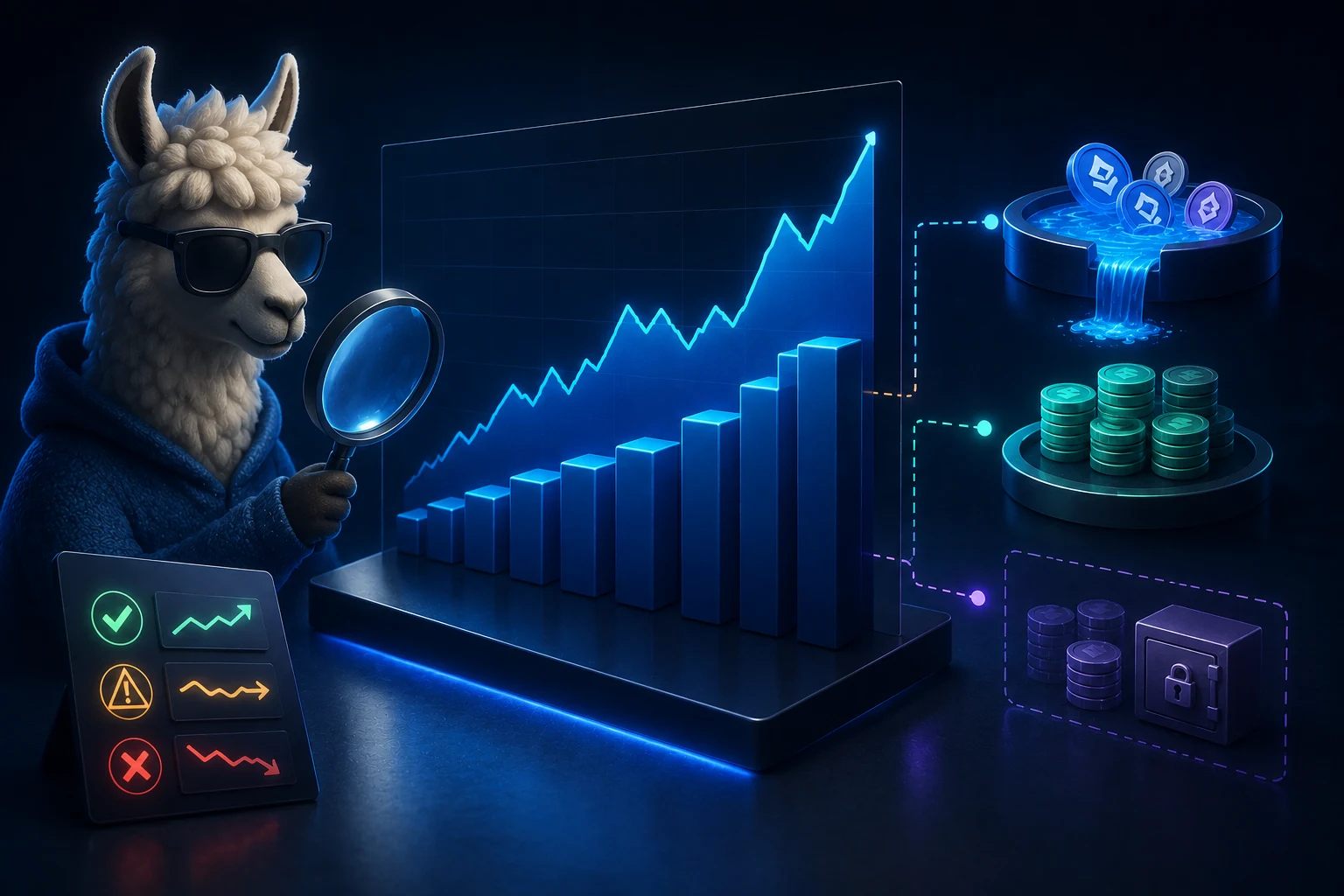
When you open a protocol page on DefiLlama, you get more than a number. The change-of-TVL chart on the right is usually more informative than the headline, because it shows whether liquidity is actually arriving or quietly leaving. A flat or falling chart with a high TVL rank is a yellow flag; a rising chart with fees trending up is the profile most analysts are looking for.
Below the chart, the TVL by Chain breakdown tells you where the real deposits sit. A protocol that claims to be multi-chain but has 90 percent of liquidity on one chain is effectively a single-chain protocol with marketing. The Categories view, accessible from the top menu, lets you compare a protocol against its peers, which is often more useful than comparing it against the entire market.
For lending protocols, switch to the Borrow view. There you see supplied assets alongside borrowed assets, and the difference between the two is the real pool of lender capital at work. A lending market with high supply but almost no borrows is mostly idle deposits, which inflates TVL without generating yield or utility. The Borrow tab is also where you spot stablecoin dominance, a useful tell for whether the market is being used by traders or parked by passive holders.
A worked example: TVL that grew without users
The cleanest way to see how TVL can mislead is to walk through a real case. In late 2023, a cluster of yield strategies built on top of GMX's GLP token attracted large sums. The strategy was simple in principle: deposit GLP, use it as collateral, borrow stablecoins, redeploy the stables into another yield-bearing position, and loop. On a TVL chart the protocol looked like it was pulling in fresh capital at a rate no peer could match.
The change-of-TVL curve was almost vertical. To an outside observer it read as a runaway winner. What it actually was, once you looked at the Borrow tab, was the same collateral being re-counted several times as it chased leverage through nested loops. When GLP's market conditions shifted, the loop unwound within days and reported TVL collapsed back to a small fraction of its peak.
The lesson generalizes. When you see a TVL curve that is steeper than the rest of the category, open the Borrow tab and the Fees tab before getting excited. If borrows and fees are not keeping pace with TVL growth, you are usually looking at leverage stacking rather than new users. The DefiLlama team has also flagged specific addresses involved in this kind of inflation, and analysts regularly use those flags to discount the headline.
How to triangulate TVL with other data
DefiLlama is the best starting point, but no single dashboard tells the whole story. The standard analyst workflow layers three additional data sources on top of the TVL number before drawing any conclusion.
The first is protocol revenue and fees, which DefiLlama also tracks under the Fees and Revenue tabs. Revenue is what the protocol actually earns from users paying for service. A high-TV, low-revenue protocol is either being subsidized or being gamed. A high-TV, high-revenue protocol with a stable or growing user base is a different profile entirely.
The second is borrow share for lending markets, already discussed above. The third is contract age and audit history, which are not on DefiLlama at all and live on the project's docs and on auditors' sites. A six-month-old protocol with a freshly audited codebase and rising TVL is a different risk profile from an unaudited fork with the same headline number.
For deeper questions, analysts pull in token unlock schedules from sources like Token Unlocks, on-chain wallet concentration from Nansen or Arkham, and custom queries on Dune Analytics. DefiLlama itself is moving toward this kind of composability through its open API, which lets you pull historical TVL and fee data into your own dashboards rather than relying on a single screenshot.
What TVL is still useful for
All of the caveats above are reasons to read TVL carefully, not reasons to throw it out. For three specific questions, DefiLlama remains the best tool available, and there is no real substitute.
The first is chain-level liquidity trends. If you want to know whether capital is rotating into Base, or out of a smaller L2, the TVL by Chain view is the cleanest free source. Chain-level numbers are much harder to inflate through loops, because most loops are protocol-specific rather than chain-wide.
The second is category-level comparisons. The Categories tab lets you see how much liquidity sits in DEXes versus lending versus liquid staking, and how that mix has shifted over time. This is the right level of granularity for top-down allocation questions.
The third is early signal on real usage. A protocol whose TVL is rising alongside fees, borrows, and active addresses is showing the multi-dimensional growth profile that usually precedes a sustainable position. A protocol whose TVL is rising alone is showing leverage, incentive farming, or marketing. The chart pattern itself is the signal; you just have to know what to look for alongside it.
How to follow DeFi liquidity the smart way
DeFi liquidity rotates faster than any retail dashboard can track, and trying to read TVL by hand is a losing game for anyone who is not doing it full-time. Zippfeed surfaces the DeFi headlines, governance votes, and protocol launches that actually move liquidity, each tagged with a sentiment label (bullish, neutral, or bearish) and an importance rating, so you can spot capital rotation the same day it happens instead of the week after.