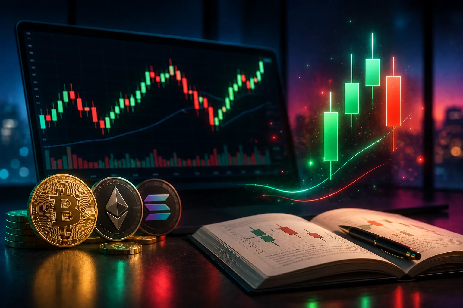
What a candlestick actually shows
If you have opened any crypto exchange or charting site, you have seen the forest of red and green bars. They look busy, but every single candle answers the same four questions about one slice of time. Those four prices are called OHLC: open, high, low, and close. Once you can read those four numbers on any bar, you can read any chart on any market in the world.
The "open" is the first traded price when the candle starts. The "close" is the last traded price before it ends. The "high" is the most anyone paid during the period, and the "low" is the cheapest anyone sold. On a one-hour chart, a candle captures all of that for sixty minutes. On a daily chart, it captures a full day. The timeframe you choose changes how much drama each candle contains.
The thick rectangle in the middle of the candle is called the body. The body spans from open to close. If the close is higher than the open, the period ended with buyers in control and most charting platforms color the body green or hollow. If the close is lower than the open, sellers won and the body is red or filled. The thin lines poking out of the top and bottom of the body are called wicks, or sometimes shadows. They mark the full range between high and low.
Wicks are the most under-appreciated part of a candle. A long upper wick means price climbed during the period, hit a high, then got sold back down. A long lower wick means price dropped, hit a low, then got bought back up. Wicks are evidence of rejection at extremes. They tell you a battle happened, not just who won. Many beginners look only at body color and miss the story in the wicks.
Risks and limitations of candle reading
Before going further, it is worth being honest about what candlestick reading cannot do. The most common beginner mistake is treating a pattern like a hammer or a doji as a buy or sell signal in isolation. Decades of academic research, including work summarized in the bulk of trader literature, find that isolated candlestick patterns have weak and inconsistent predictive power, especially on assets that trade around the clock like BTC and ETH.
Several real failure modes are worth naming. First, crypto trades twenty-four hours a day, seven days a week. That means a "daily candle" can be gapped by weekend liquidity, news at 3 a.m., or a single liquidation cascade. The same pattern that worked on a stock market that closes at 4 p.m. behaves differently on an asset that never closes. Second, leverage distorts every candle. On perpetual futures, large positions can pin price to a level, creating artificial wicks and bodies that look meaningful but vanish the moment the position closes. Third, the patterns you see in textbooks were largely documented on equity markets decades ago; their statistical edge on a modern crypto chart is much smaller than old books suggest.
There is also a psychological trap. Once you know a pattern is "bullish," you will start seeing it everywhere. This is called confirmation bias, and it inflates your sense of edge. Many retail traders who learn patterns first end up over-trading, taking every doji as a reversal, and wondering why their win rate hovers near fifty percent minus fees. Recognizing this bias is part of learning to read charts honestly.
Finally, candle reading without context is incomplete. A hammer at the bottom of a range looks very different from a hammer in the middle of a parabolic move driven by an Elon Musk tweet. Context, including volume, funding rates, and what is happening on-chain, is what turns a shape on a screen into a useful observation.
Decoding open, high, low, and close on a single candle
Let's walk through one candle to make this concrete. Imagine you are looking at a one-hour ETH candle. The open is $2,000, the high is $2,080, the low is $1,960, and the close is $2,060. The body spans from $2,000 to $2,060, so it is a green body of $60. The upper wick from $2,060 to $2,080 is $20 long. The lower wick from $1,960 to $2,000 is $40 long.
What story does that tell? During the hour, buyers and sellers opened at $2,000. Sellers pushed price down to $1,960, where buyers stepped in and absorbed the selling. Price then climbed to a peak of $2,080, where some profit-taking happened. By the end of the hour, the market settled at $2,060, well above where it started. The long lower wick suggests the dip was rejected. The short upper wick suggests the rally was accepted, though not without resistance. That single candle is a small narrative, not just a green bar.
Now flip the example. Same open at $2,000, but the high is $2,030, the low is $1,920, and the close is $1,940. The body is red, spanning $1,940 to $2,000, a $60 drop. The upper wick from $2,000 to $2,030 is small. The lower wick from $1,920 to $1,940 is also small. This is a clean selloff with little rejection. Buyers barely showed up, and the period ended near the lows. Contrast that with a candle that has the same red body but a long lower wick reaching well below the close. That wick says, "sellers tried, but buyers fought back hard and the period recovered most of the drop." The shape carries meaning the color does not.
Wick-to-body ratio is a quick visual cue. A candle with a body much larger than its wicks is decisive, dominated by one side. A candle with wicks much larger than its body is indecisive, a back-and-forth period with no clear winner. Neither is inherently bullish or bearish on its own. It depends on where the candle appears in the broader structure.
Common patterns and why they are weaker than they look
Every charting book teaches a set of named patterns. You will run into doji, hammer, shooting star, engulfing, morning star, evening star, spinning top, and marubozu, among dozens more. They are useful vocabulary. They are not magic. Here is what the most common ones really describe.
A doji is a candle where the open and close are almost identical, leaving a very thin or flat body with wicks on both sides. It means the market opened, moved, and came back to where it started. By itself, a doji is indecision, not a reversal. In a strong trend, dojis are common and often resolve in the direction of the trend, not against it. In a range, a doji can mark a turning point. Context decides.
A hammer is a candle with a small body near the top of its range and a long lower wick, ideally at least twice the body length. Textbook interpretation: sellers pushed price down, buyers rejected the low, period closed near the high. Hammers are supposed to be bullish reversal signals at the bottom of a downtrend. In practice, hammers appear constantly on crypto charts, and many of them lead to further downside. They are a clue, not a verdict.
A shooting star is the mirror image: small body near the bottom, long upper wick, appearing after an uptrend. Same caveat. It can mark exhaustion, or it can be a brief pause before continuation.
An engulfing pattern is a two-candle setup. A small green candle followed by a larger red candle that "engulfs" it is bearish engulfing. A small red candle followed by a larger green candle that engulfs it is bullish engulfing. The idea is that the second period completely overpowers the first. Engulfing patterns have a slightly better historical record than single candles, but the edge is still modest and depends heavily on where they appear in the structure.
The honest summary: these patterns are heuristics, mental shortcuts for naming what already happened. Their predictive value is real but small, much smaller than the typical YouTube tutorial implies, and it erodes fast in markets with high leverage, low liquidity, and 24/7 news flow. Use them as vocabulary. Do not trade on them alone.
How timeframes distort the signal
The same price action can look completely different on different timeframes, and this is a major source of confusion for beginners. A five-minute candle is a tiny slice of market activity. A weekly candle compresses a hundred and sixty-eight hours into one bar. Patterns that look significant on a five-minute chart are often invisible noise on the daily, and vice versa.
Lower timeframes are noisier. They are more sensitive to order flow, short-term liquidations, and exchange-specific behavior. A hammer on the one-minute chart of a low-cap altcoin is essentially meaningless. A hammer on the weekly chart of BTC after a multi-month drawdown is a much more serious observation, because the signal is harder to fake.
Higher timeframes are smoother but lag. A daily engulfing pattern only confirms at the close of the day, by which time much of the move is already over. Many traders use a multi-timeframe approach: look at a higher timeframe for context, then drop to a lower one for entry. This is a reasonable workflow, but it does not magically make patterns more predictive. It just helps you trade in the direction of the larger structure.
There is also a specific crypto distortion: perpetual futures funding and liquidation cascades can create patterns that look meaningful on any timeframe. A long lower wick on a fifteen-minute candle might be the result of a single liquidation event that wiped out leveraged longs. The wick is real, but the interpretation ("buyers stepped in!") can be wrong. The actual cause was forced selling, not organic demand. This is why candle reading without context can mislead.
What candles alone miss
A candlestick chart is a record of price. Price is the most important signal, but it is not the only one. Three other data layers are essential for any honest read of a crypto market, and Zippfeed's crypto sentiment workflow is built to surface them alongside price.
The first is volume. A green candle on high volume means broad participation. A green candle on low volume can be a fake-out. Most charting platforms let you overlay volume as bars under the price chart. The shape of those bars often tells you more than the candles above them. Look for volume to confirm breakouts and to warn you when a move is thinning out.
The second is derivatives data. Funding rates, open interest, and liquidation heatmaps tell you how much leverage is in the system. A breakout on rising open interest is more credible than a breakout on falling open interest. Extreme funding rates mean the market is crowded, and crowded trades tend to unwind violently. None of this is visible in a candlestick.
The third is on-chain data. Exchange inflows, whale wallet activity, stablecoin minting, and staking flows all give context. A BTC rally accompanied by large exchange outflows is structurally different from a rally accompanied by exchange inflows. The first suggests holders are accumulating. The second suggests they are preparing to sell.
Candles plus volume plus derivatives plus on-chain data is closer to a complete picture. Candles alone are one instrument in an orchestra. Treat them that way.
Building a practical reading workflow
So how should a beginner actually use candlesticks? A reasonable workflow starts at the top with the highest timeframe you can stand to watch. For most retail traders, that is the daily or four-hour chart of BTC or ETH. Mark out the obvious range, support, and resistance. Look for the dominant trend, if any. Note the most recent swing high and swing low.
Once you have the higher-timeframe context, drop to a lower timeframe, say one-hour or fifteen-minute, and look for candles that occur at the structural levels you marked. A hammer at the bottom of a multi-week range, with a volume spike, is a much more interesting observation than a hammer in the middle of nowhere. A bearish engulfing candle right into a major resistance zone, with funding rates already elevated, is a meaningful warning sign.
Always overlay volume. Always check funding and open interest if you can. Cross-reference with on-chain flows when something dramatic is happening. And never, ever, take a single pattern as a green light. The point of reading candles is to slow down, structure your observation, and avoid impulsive decisions. The patterns are vocabulary. The decision is yours, and it should rest on a stack of evidence, not one shape.
Keep a trade journal. Write down what you saw, what you expected, and what actually happened. After fifty trades, you will know which patterns you personally react to, which ones you are good at reading in context, and which ones you should ignore. Candlestick reading is partly a craft, and crafts are learned by doing, not by memorizing a book of patterns.
Stay ahead of crypto price action with Zippfeed
Crypto price action moves fast, and so does the news around it. Tracking funding, liquidations, exchange flows, and sentiment manually is a losing game. Zippfeed surfaces BTC and ETH headlines with sentiment scoring (bullish, neutral, or bearish) and an importance rating, so you can build the contextual layer your candlestick reading is missing and make sense of what each candle is really telling you.