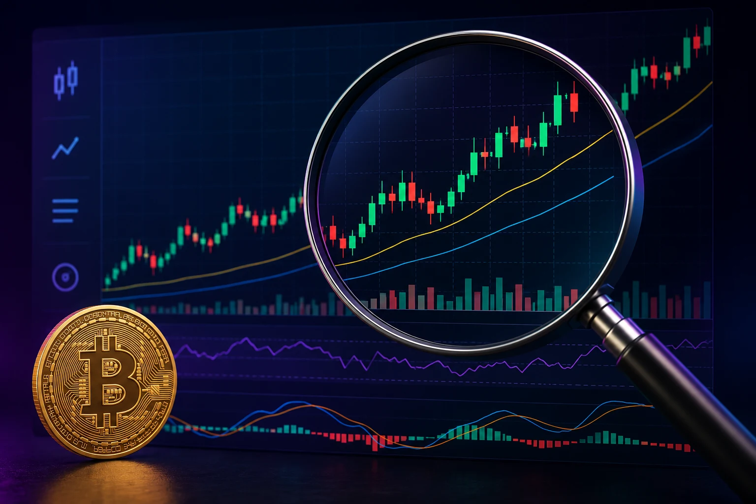
Step 1: Understand what a candle actually shows
The bar most charts use is a candlestick. Each candle represents one time block — could be a minute, an hour, a day, depending on the chart setting. A candle encodes four numbers for that block:
- Open — price at the start of the block.
- Close — price at the end of the block.
- High — highest price reached during the block.
- Low — lowest price reached during the block.
The fat "body" runs from open to close. The thin lines (wicks) reach up to the high and down to the low. Color signals direction: green/white usually means close was higher than open (price went up during the block), red/black means the opposite. That's it. A candle is just a compact way to show four numbers.
Step 2: Pick the right time-frame
The same chart looks completely different at 1-minute, 1-hour, daily, and weekly time-frames. Each has its place.
- 1-minute / 5-minute. Mostly noise. Useful only for very short-term execution, not for decisions.
- 1-hour / 4-hour. Where short-term traders live. Trends here are real but can flip fast.
- Daily. Most retail traders' default. Smooths out a lot of noise; trends here have more weight.
- Weekly / monthly. Where long-term investors live. Best for the big picture but slow to react.
Rule of thumb: match the time-frame to your decision horizon. If you'd hold a position for weeks, a 5-minute chart is not your reference. Most beginner mistakes come from staring at too-short time-frames and reacting to noise.
Step 3: Read the volume bar
Below most charts sits a row of vertical bars: volume. Each bar shows how much was traded during that time block. Volume is the single most underrated piece of information on a chart.
A price move on high volume means many people participated — it's harder to fake. A price move on low volume means a small number of trades pushed price — less reliable, often reverses. When you see a big breakout on tiny volume, that's a warning. When you see a price drop on huge volume, conviction is real and a quick bounce is unlikely.
Step 4: Spot support and resistance
The simplest, most useful concept in chart-reading is the idea of levels.
- Support is a price area where buyers historically stepped in — price tends to bounce off it.
- Resistance is a price area where sellers historically stepped in — price tends to stall against it.
Draw horizontal lines through obvious past highs and lows. These are not magic — they work because traders see the same levels and act on them, creating a self-fulfilling feedback loop. They break often. But knowing where they are tells you where reactions are likely.
Step 5: Use a couple of basic indicators (not twenty)
You can layer hundreds of indicators on a chart. Don't. A few useful ones, with honest descriptions of what they do:
- Moving averages (MA / EMA). A smoothed line of average price over N days. A 50-day MA and 200-day MA together give you a rough trend reading.
- RSI (Relative Strength Index). Oscillates 0-100. Above 70 is conventionally "overbought," below 30 "oversold." Useful as a sanity check, not a trade signal on its own.
- MACD. A trend / momentum gauge. The crosses get talked about a lot; in practice they generate many false signals.
Honest statement: most indicators are lagging — they describe a move that already happened. They're context, not a forecast. Anyone selling "the perfect indicator" is selling something that doesn't exist.
Common mistakes
- Trusting tiny time-frames. 1-minute and 5-minute candles look like patterns to the brain even when they're random.
- Drawing 47 lines. If everything looks like support, nothing is support.
- Overfitting indicators. Stacking RSI, MACD, Bollinger Bands and Stoch RSI is not insight — it's confirmation bias with a UI.
- Ignoring volume. A move without volume isn't really a move.
- Trading off charts alone. Charts tell you nothing about why something is happening. News, fundamentals, and on-chain data are missing context.
The safety checklist
Before acting on what you see in a chart:
- Have you checked volume and not just price?
- Is your time-frame matched to how long you'd hold?
- Is there news or a fundamental event you're missing?
- Would you be okay if this move reverses immediately?
- Is the position sized so a loss isn't catastrophic?
Charts describe the past. Risk management is what protects you from the future.
Read charts in the context of the news
A chart move without context is a guess. Price action almost always has a story behind it — a launch, an ETF flow, an exploit, a macro print. Zippfeed pairs crypto headlines with sentiment and importance scoring across multiple sources, so the move you're looking at on the chart comes with the actual reason it happened. Reading charts side-by-side with news turns technical analysis from guesswork into context.